Eric FRASER
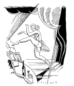
 If ever a jacket illustration gave lie to the maxim that one shouldn't judge a book by its cover, it is Eric Fraser's wonderful depiction of the trying-hard dancing girl which appeared on the cover of Brighter French in 1927. No drawing ever has captured more successfully the raw exuberance of the 1920s Paris nightclub, or could better herald the style, gaiety, and 'Gallic salt' of the text. Yet the life of this quiet, hard-working family man, who was one of the most admired and in-demand illustrators of the twentieth century, was far removed from that world. 'There would be no stories of wild nights in Montparnasse or Montmartre,' writes Alec Davis in The Graphic Work of Eric Fraser *.
Much of Eric Fraser's work is well known, such as his illustrations for the Radio Times, his iconic 'Mr Therm' (used for over 30 years by the gas industry), his London Underground railway posters, his stamp designs for the GPO, etc. Unusually for an illustrator, he received much fan mail. He produced book covers and illustrations for the Folio Society and the Limited Editions Club of America, and was always (as in Brighter French) masterful at capturing the essence of the text. An art editor of the Radio Times, R.D. Usherwood, said of him:
…there was never a time when he did not have an uncanny gift for going to the heart of a script and epitomising the whole weight of it in a single drawing. This is essentially an intellectual gift; he draws what he thinks and feels and seems incapable of irrelevance. **
Eric Fraser was born in Westminster, in the heart of London, in 1902. His background was not artistic—his father was a solicitor's clerk and his mother was a schoolteacher—but his artistic gifts were recognised early. In 1916, and while still a pupil at Westminster City School, he started attending evening classes at Westminster School of Art. The painter Walter Sickert held life classes at the school, and the 14-year-old Fraser's first attendance at one of these made an unforgettable impression on him:
I went up with my drawing board to the top floor, entered the life class … and started work. Shortly afterwards, an elderly lady crept up and whispered to me that this was the ladies-only life class, and directed me to the gents-only life class. When I came home with a drawing of nude ladies, my parents took a dim view of this and removed me immediately. So you see Sickert hardly had a chance to exert an influence on me. **
 Fraser did return to the evening classes, however, and in 1919, he won a scholarship to Goldsmiths School of Art (part of the University of London). In 1923, while still a student, he had an etching exhibited at the Royal Academy, and also did some teaching at the college. Francis Marriott, headmaster of Goldsmiths at the time, later wrote of Fraser:
'He was undoubtedly one of the most brilliant students I had in the School during the 34 years I was headmaster.' **
Fraser's most significant magazine client was the Radio Times, but he did work for many others, including Vogue, Lilliput, Pall Mall, Nash's Magazine, and did a large amount of fashion illustration for Harper's Bazaar from 1929 to 1937 (before advances in technology allowed photographs to take over). The principal purpose of fashion illustration was to make the clothes look good, and the illustrators succeeded brilliantly in this (far better than the photographers who replaced them) not least because they were unrestricted by the limitations of the human shape. Later Fraser gave his own view of the magazine's house style:
Harper's Bazaar in the thirties—full of magnificent women 10 feet tall, aesthetically unreal, but beautifully created by artists who were also designers—the great era of release from Edwardian Art Nouveau—the new art phœnixed from the ashes of the late war. These women could not be produced through a lens, only we artists could evolve such creatures.
'Do not fear, the camera will never take the place of the artist,' said the Art Editor, Alan McPeake—forty years on—the artist will never take the place of the camera, I fear. *
Using the experience he gained at Harper's Bazaar, Fraser would also teach fashion illustration—at the short-lived London branch of the Berlin Reimann School, which closed in 1940.
From 1928 to 1940, Fraser taught at the Camberwell School of Arts and Crafts in London. His subjects included book illustration (his first of 37 book illustration commissions having been for Brighter French in 1927). The effect he had on his students is described by William Johnstone, who headed the school from 1938:
Another splendid teacher was Eric Fraser, the brilliant graphic designer… In all the work he did, whether wood or scraper-board engravings for the Radio Times, line drawings or posters, his craftsmanship was superb. He lived his work, slept with it, woke with it, taught with it. Fraser was a bulwark in the school, although he was a very gentle, unassuming soul. Fraser would not have fought with a fly, but he was so serious and so expert at what he did that not a student spoke or even sneezed in Eric Fraser's class, they were so fascinated and so impressed by this tiny, frail, blond man. **
Sylvia Backemeyer re-quotes these comments of Johnstone in her book Eric Fraser Designer & Illustrator **, but quickly points out: 'In fact Fraser was nearly six foot tall.'
In World War II, Fraser worked as a Civil Defence Warden. As he later explained, the demands of his civil defence work made it impossible for him to continue teaching at Camberwell:
One day, exhausted, I went to sleep in the staff room and woke up to find an air raid on, with everyone else in the basement. I gave up teaching after that. **
Throughout his career, his style evolved. Alec Davis gives the following assessment of his drawings from the 1920s, many of which are very funny.
In technique, they showed a reaction against academic representational drawing of the kind which he had turned out steadily and more than competently during his student years. Angles instead of curves, distorted shapes instead of natural shapes—these were the outward and visible signs of an inward and spiritual revolt. They were characteristics that suited the debunking mood of the time…*
After the war, his work would become more serious. He became deeply involved in book illustration, producing remarkable illustrations
for the Folio edition of The Lord of the Rings, for instance, always adapting his technique to suit the mood of the text. He explained:
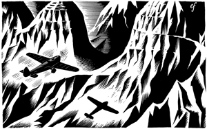
A dramatic story will require an illustration made up of bold and strongly contrasting masses, while a love story will need a gentle treatment and soft gradations of tone.*
Over the decades, his style continued to evolve and, in the words of Wendy Coates- Smith, in her essay Eric Fraser the Illustrator, it became 'tougher and more "graphic" ' as the images were competing with other visual material—including television—for space and impact.**
Another commentator, however, suggests that the drift from the light and humorous to the serious and more 'graphic' style began as early as 1928, with a commission from the Radio Times to illustrate a script that was 'tough and a mite sordid.' The words are those of Rufus Segar who wrote in 1979 in the magazine of the Association of Illustrators:
…it was the engagement with the text that set him on a serious and dramatic path for illustration. Up to this time he had considered his work light and humorous, the sketches done in simple style, strong line and fractured planning… Now the more serious graphic style was founded, the subjects done with more research and composition, the finishing a steady and inventive application of patient craft. *
 The most versatile of artists, Fraser also designed panels and stained glass for various churches including St Mary at Hampton (< left) and Westminster Abbey, and murals for the Wembley Exhibition of 1923, the 1951 Festival of Britain Exhibition, and the Brussels Exhibition of 1958. His agent throughout his career was R.P. Gossop, a graphic designer who had been head of the design studio at WH Smith.
In 1925, Fraser married Irene Lovett (pictured at right > with him at the Chelsea Arts Club Ball of that year); and of the couple's close relationship, and of the personality of the artist who was 'so gentle that he would always carefully take a spider outside to set it free rather than kill it,' their son Geoffrey wrote:
He always showed my mother every drawing as it was finished, and before it was sent away. He would leave it on the hall table for her to see, as though, in a way, he felt that it was theirs not his… He hid himself away too, and only in the later years of his life could he be persuaded very occasionally to appear at functions connected with his work. He never was a speaker. He would be summoned from his studio, when there were visitors to the family home, and he was always pleased to see them. But very soon you would notice that he was no longer present, and he would be found back at his studio desk. I have sometimes wondered whether his prodigious output of drawings was one way in which he defended his shy nature from the world outside. *
In 1935, the family settled at Hampton, where Eric Fraser lived and worked (in a studio at the end of the garden) until his death in 1983. The self-portrait opposite > was drawn in 1949.
Phaeton Publishing is extremely grateful to Eric Fraser's son the Revd Geoffrey Fraser, and to the Fraser family, for their permission to use his sparkling illustrations in the 2010 edition of Brighter French.
[Text above © Copyright 2010 Phaeton Publishing]
Books referred to:
* The Graphic Works of Eric Fraser by Alec Davis (The Uffculme Press, Dalvey House, Great Malvern, 1974 & 1985)
** Eric Fraser Designer & Illustrator by Silvia Backemeyer (Lund Humphries Publishers, Russell Gardens, London, 1998)
-86x12.gif)
.jpg)
.jpg)
